“The world sucks – vote for me.” That’s the vote-getting narrative that has worked wonderfully well for our politicians. And, the media has complied as well. That’s not because they want to, but because their business model requires them to sell negativity and fear. As humans, we’re drawn to that stuff.
The folks at “The World in Data” from the University of Oxford have created a public good to help counter this. They are a team of 3 who’ve gathered evidence on data around indicators of progress such as extreme poverty, education, and child mortality. And, to make it easy to consume, they’ve helped us visualize this in “The World as 100 People.”
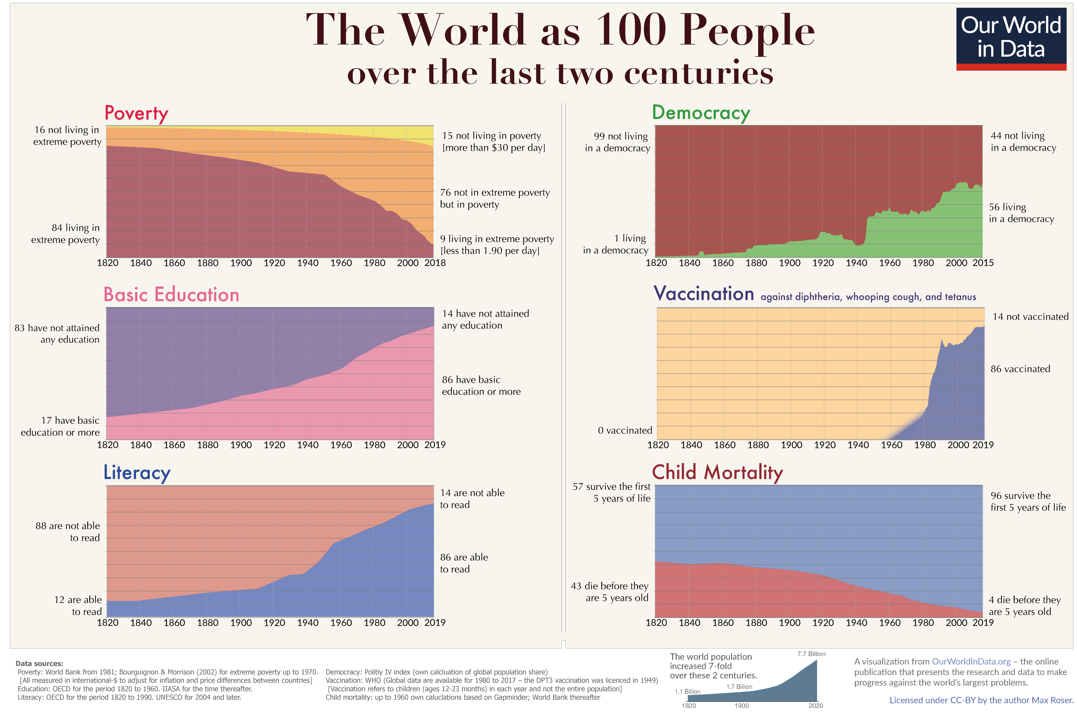
Of course, the world doesn’t suck. In fact, things are better than they’ve ever been. Does this mean things are better for everyone? No, it doesn’t. There is and always will be plenty to do. But, it also means a lot of the current narrative around the state of the world is nonsense.
What is the probability of “The World in Data” actually making the difference they seek? Very low. They don’t have the megaphones that our politicians have. And, there aren’t that many folk who are interested in looking at empirical data if it doesn’t show up as a sensational article on their Facebook feed.
But, maybe we could help improve the odds? Perhaps we could share their findings, one person at a time? Maybe we could better educate ourselves, our families and our communities? And, maybe, just maybe, we could use all this data to make better decisions.
Thank you, “The World in Data” team, for giving us the opportunity to make a difference. Now, it is on us to spread the word.
PS: Their blog has only 58 followers on Feedly. That’s a travesty. Let’s fix that.
 (Thanks to the
