Adding affordances to your Ux

So, what are affordances? An affordance is a possibility of an action on an object.

These are examples of physical affordances we take for granted. They make it easier to avoid user error and confusion. Hat tip to Don Norman who taught us this via his masterpiece – The Design of Everyday Things.

Affordances are everywhere – we just don’t notice them when they’re working well. But, they’re evident when they don’t work.

One such place I was hoping for an affordance was with the new, free Microsoft OneNote. I swear by OneNote and have done so for a decade now. Every year, or so it seems, I write at least one post on this blog professing my love.

The one challenge with OneNote is that collaboration on it has never really worked easily for me. But, I thought that might change in the new, free version that comes with Windows 10 which syncs seamlessly with OneNote.com and the mobile apps. It really is beautiful and has been a game changer for me.

However, I’m still not sure how the sharing system should work.

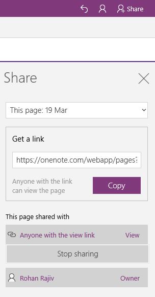
The current issue is that trying to click on the “Anyone with the view link” or “View” simply tells me that I have an option to “Stop Sharing.” That’s not enough. My general assumption is that I’ll be able to tweak the settings to be able to allow others to edit. This assumption comes from how the sharing button normally behaves on the web (read: Google Docs). But, I’m not sure if that applies here. A simple shortcut might be a tool tip or some breadcrumbs I can follow to an article that details sharing on OneNote.

Overall, I’m taking away 2 lessons from this experience:
1. Don’t assume your users will find your user experience intuitive. Make it easy for them to find help or ensure there are affordances to make it easy for them.
2. Users will only be committed to seeking help if you have an existing bank of goodwill or if they have invested heavily in using your tool. There are a collection of tools in my life – OneNote, Dropbox, my iPhone – which inspire a large amount of goodwill. So, if you’re not among them or are trying to build that goodwill, making users feel supportive takes on paramount importance.

Bad design makes you look stupid

Flush toilets are not designed for men. I take particular issue with American flush toilets as they have an absurd amount of static water once you flush. As you can imagine, the combination of a high level of static water and water dropping from a height means the resulting physics isn’t pretty. I’ve joked about this issue for many a time now and, from the reaction I get from other males, I realize I’m not alone in this view.

Why, then, are flush toilets designed so bad? Well, I don’t know yet but I intend to find out. I guess my second question is – why don’t we just have urinals at home? I’m guessing men all over will appreciate that.

The deeper point here is that bad design makes users look stupid. So, if the users of your product/service are exhibiting stupid behavior, it is not their fault, it is yours. User error is regularly just a manifestation of poor design. A small tweak in design can fix the most absurd problems. For example, making sure the ATM card pops out before the cash comes out ensures users don’t walk away with the ATM card in the machine.

The flip side of this is – as a user, if you are unable to figure out what to do on an app or a website, it probably isn’t your fault. That hotel shower handle that gives no indication about which direction you need to turn to get the right water temperature? Definitely not your fault. Sadly, many designers’ biggest takeaway from Apple’s success in the past decades has been to make things pretty. The iPhone didn’t become the phenomenon it is because it is pretty (it definitely is pretty), it became the phenomenon it is because it is simple to use.

At the end of the day, great design is all about making things easier for the user. And, as we’re all designers – of experiences, events, and lives – and primary users of our products and services, it is important that we design processes and environments that, first and foremost, just work.

Paul Bennett on Design – MBA Learnings

Paul Bennett, Chief Creative Officer at IDEO, the famous design firm, was at school yesterday. He delivered an engaging 50 minute talk on his perspectives on love, beauty, religion, and death. I am not going to attempt a perfect summary of the talk. But, I thought I’d attempt what I took away..

– We are all designers. Businessmen design businesses, teachers design classes, etc. This was the all important base line we started with. Now that we understand we are designers, let us learn to think like one and understand the sorts of barriers design is breaking through in today’s world.

– Design transcends agenda. This was a profound line from a conversation with a princess from the royal family in the UAE. Paul had conducted a brainstorming session in Dubai where he’d asked designers for their dreams for Dubai. The women designers had written some really powerful thoughts along the lines of “we want to matter.” Paul had shared these in his TEDx talk the next day as a way of thinking about designing Dubai in the future. As a designer, sharing these wasn’t about judgment. It was about transcending the agenda and meeting purpose.

– Remember to answer the question. He spoke of the moment when he had been diagnosed with diabetes. He was listening to the doctor throw all sorts of medical terms when he had just one question in mind – “will I be able to eat during thanksgiving?” Sometimes, all we’re looking for is answers to the simple questions – e.g. “will I be okay?,” “do I have a real shot at this opportunity?,” or “will you give me a hug?” Let’s design for those.

Death and religion. Paul spoke about how IDEO is designing for taboo topics like death and religion. These topics are entering the mainstream and they make for great design opportunities. And, while topics like “designing for death” remains somewhat morbid, the fact is that most human beings share common misconceptions and irrational fears around death. Can we make the experience better? (We don’t know yet but we’re certainly going to try!)

Conversation is design. This was the most powerful insight I walked away with. In the vein of us being designers, I think we can extend the “we are all designers” insight into the idea that we all design lives, moments and experiences. And, maybe, we could make more of an effort to design conversations that matter? It isn’t easy to have these conversations around topics like religion, fear, death, and all the other difficult issues that we face in society. But, if we don’t, who will? And, how will we inform our responses to these topics if we aren’t exposed to viewpoints different from ours?

I loved Paul’s talk. He was warm, vulnerable and humorous. It definitely made me think.

And, I think I’ve walked away with ideas for a couple of my projects as well as for my lives. I can think of 2 that I’m going to work hard to implement –

1. Consciously design experiences when designing products, services and events. Apple just sold its one billionth iOS device in what was a quarter described as “monstrous.” They get this idea. Buying an iPhone is designed as an experience. Unwrapping it is part of the experience and using it is definitely another. In the final analysis, it is because we don’t remember what we did.. we do remember how we felt.

2. Have more tough conversations. The inner geek in me loves this idea. In some ways, the talk reminded me of why I am in school – to get exposed, to think, to reflect. There are so many great conversations to be had. And, it is up to me to make them happen.

Whatsapp’s annoying notification screen

Whatsapp
Ever since the latest Whatsapp update, I find myself having to close this screen nearly every time I open up the app. Notifications for most apps on my phone are turned off as I like checking them when I want to. This is just a massive annoyance.

A couple of thoughts on this –

1. Some Whatsapp Product Manager probably decided this might be the best way to make sure users always turn on notifications. Perhaps it is one of their key performance indicators. If this is the case, it strikes me as a shockingly short term move that will only ends up annoying users. I’ve been a big Whatsapp cheerleader on this blog before. This screen is killing that goodwill.

2. There’s one part of me that would just like to say – “Give us some credit, Whatsapp. How about thinking we users might actually know how to operate a phone?”

3. Then, there’s the other side that wonders if the Product Managers/Engineers at Whatsapp have lost touch with the user. Maybe they love the app so much that they can’t imagine a scenario where users may want no notifications on their phone?

4. Now, if users actually do need help with understanding how to switch on notifications, there is still middle ground. For example, they could design the app such that I have an option to stop the screen from showing up (like the “Don’t show this again” checkbox).

A nice learning for all of us who design product experiences for users. If you’re designing a “reminder” feature that will annoying your user into doing what you’d like them to do, stop. There’s always another way.

Always.

Ooch before you leap – The 200 words project

.Here’s this week’s 200 word idea from Decisive by Chip Heath and Dan Heath.

 In 2006, John Hanks, an executive at “National instruments,” was thinking about making a bet on wireless sensors. The technology had a lot of promise but it needed to be understood if it would survive tough environments like mines and oil rigs.

So, Hanks did what National Instruments usually does – “Ooch.” An ooch is a small experiment to test a hypothesis. He worked with Electrical engineers at UCLA to install wireless sensors in a jungle in Costa Rica for an experiment to understand changes in carbon dioxide in the forest. If they were to work, they would have to not only be accurate but resistant to heavy rainfall and other elements of nature.

They worked. After a few more ooches, John and team began developing wireless sensors with $3M investment and that business has been a key part of National Instruments offering since.

This is common practice in some professions, e.g., designers call it prototyping. If it is not normal practice in what we do, perhaps we should consider an “ooch” before we make major decisions e.g. spend two weeks in a new place before we make a permanent shift.

Ooch before you leap

Source and thanks to: www.EBSketchin.com

‘The best way to show that a stick is crooked is not to argue about it or to spend time denouncing it, but to lay a straight stick alongside it’ | D.L.Moody